

Every time a user opens an application or lands on a website, they make immediate, subconscious judgments. These split-second decisions are heavily influenced by visual elements. The right hues guide attention, build trust, and drive user action. Conversely, a poor palette frustrates visitors and drives them away faster than slow loading times.
Understanding color theory and design is a fundamental requirement for creating intuitive digital experiences. It goes far beyond simply picking favorite shades or following the latest aesthetic trends. By learning how humans perceive and react to different combinations, designers can craft interfaces that look beautiful and function seamlessly.
When you intentionally apply these principles, you create a silent language that communicates directly with your audience. This guide will explore the psychological impact of color, the core rules of combining shades, and practical ways to implement these concepts to elevate your user experience.
The Psychology Behind Color Choices
 Before selecting a color palette, you must understand the emotional weight different colors carry. Human beings have deeply ingrained psychological responses to specific hues. These reactions are shaped by nature, culture, and personal experiences.
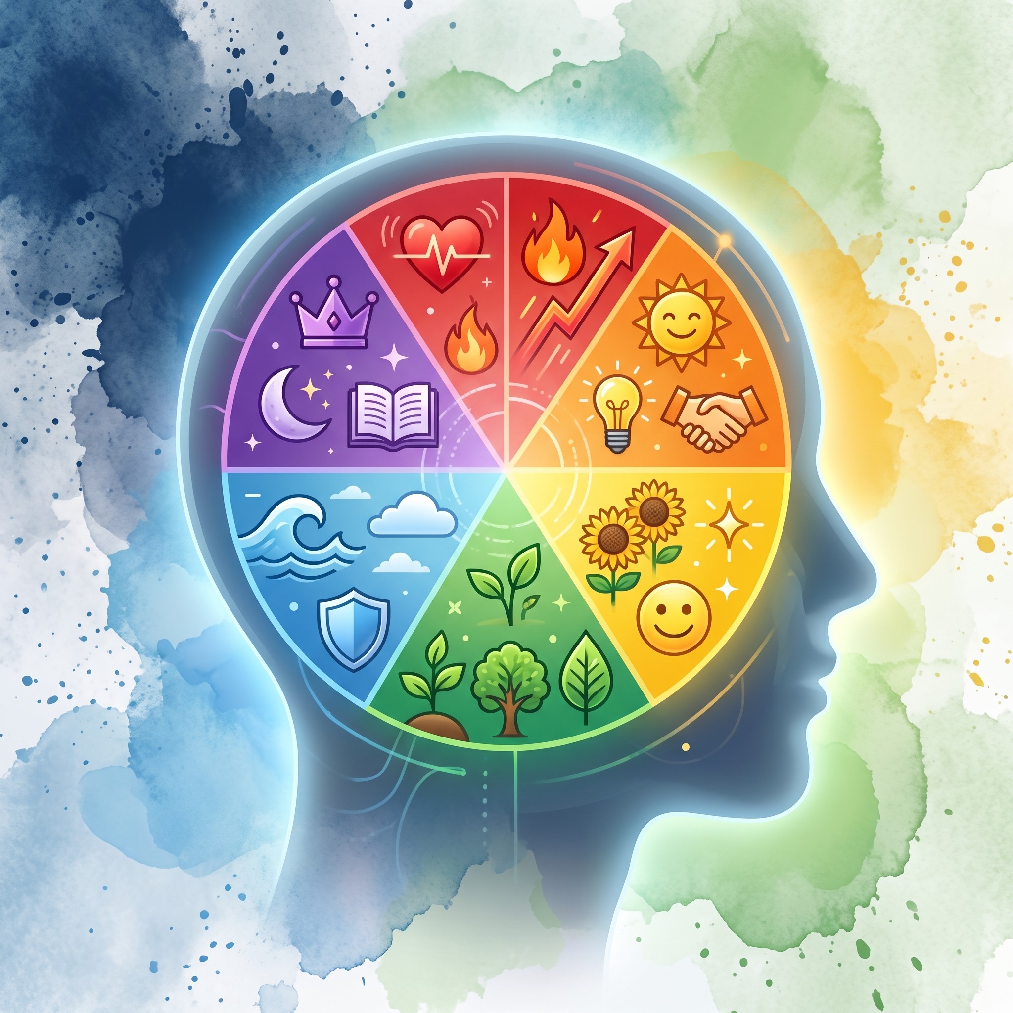
Red often signals urgency, excitement, or danger. This makes it highly effective for error messages or clearance sale buttons. Blue, on the other hand, promotes a sense of calm, security, and reliability. It is no coincidence that major financial institutions and social media platforms rely heavily on blue to establish trust with their users. Green is universally associated with growth, nature, and success, making it the perfect choice for confirmation messages or eco-friendly brands.
However, context is everything. A bright, neon green might work perfectly for a fitness app but would feel completely out of place on a luxury banking website. You must align your color choices with the emotional response you want to elicit from your target audience. If your interface clashes with the user’s expectations, their overall experience will suffer.
Core Principles of Color Theory and Design
To build interfaces that resonate, you need a solid grasp of how colors interact. This structural knowledge is what separates amateur layouts from professional, high-converting platforms.
The Color Wheel and Relationships
The color wheel is the foundation of all visual composition. It organizes colors into primary (red, blue, yellow), secondary (green, orange, purple), and tertiary categories. Understanding this wheel allows you to create harmonious combinations.
Analogous colors sit next to each other on the wheel. They create a serene, comfortable design that is easy on the eyes. Complementary colors are positioned opposite each other. When paired, they create high contrast and draw immediate attention to specific elements. Triadic colors are evenly spaced around the wheel, offering a vibrant and balanced look even when using bold shades.
Contrast and Legibility
Great user experience relies heavily on readability. If users cannot read your text, they will leave. High contrast between text and background colors is a non-negotiable rule of interface design. Dark text on a light background remains the most readable combination for lengthy paragraphs.
You should also use contrast to highlight important features. If your website has a predominantly neutral background, a brightly colored call-to-action (CTA) button will naturally draw the user’s eye.
The 60-30-10 Rule
A highly effective method for applying color in digital spaces is the 60-30-10 rule. This classic design principle suggests that 60% of your interface should be a dominant color, 30% a secondary color, and 10% an accent color.
The dominant hue usually serves as the background. The secondary shade provides structure and supports the primary hue, often used for secondary buttons or navigation bars. The accent color is reserved for the most critical elements, such as primary CTAs, alerts, or important links. This ratio provides visual balance and prevents the interface from feeling chaotic or overwhelming.
Applying Color to User Experience
 Knowing the theory is only half the battle. The true challenge lies in applying these concepts directly to user interfaces to solve problems and guide behavior.
Establishing Visual Hierarchy
Visual hierarchy dictates the order in which users perceive information. Color is one of the most powerful tools for establishing this order. Brighter, more saturated colors naturally attract attention first, while muted, desaturated tones recede into the background.
When designing a dashboard or a landing page, assign your boldest colors to the most critical actions. Less important information should be styled in softer tones. This subtle guidance prevents cognitive overload, allowing users to navigate your platform intuitively without having to search for the next step.
Accessibility and Inclusivity
A beautiful design is useless if a portion of your audience cannot interact with it. Accessibility must be a primary concern when implementing color theory and design. Millions of people experience some form of color vision deficiency, commonly known as color blindness.
Never rely solely on color to convey critical information. If an input field has an error, do not just turn the border red. Include an explicit text warning or an easily recognizable icon. Additionally, always check your color combinations against the Web Content Accessibility Guidelines (WCAG) to ensure sufficient contrast ratios. Accessible design is simply good design.
Consistency Across Platforms
Your color choices should remain consistent across every user touchpoint. A fragmented visual identity confuses users and dilutes your message. From the mobile application to the desktop website, the palette must be unified. This consistency reduces the learning curve for users switching between devices, making the overall experience feel cohesive and polished.
Modern Tools Elevating Design Workflows
The tools available to digital creators have evolved significantly, making it easier than ever to implement complex design strategies effectively.
When establishing the foundational guidelines for a project, a visual curriculum design tool can help teams map out the educational journey of their users, ensuring that color cues are used consistently to guide learning and onboarding. This structured approach helps stakeholders visualize how colors will impact user flow before a single line of code is written.
Furthermore, static interfaces are becoming a thing of the past. Incorporating ai motion graphics into your UI can bring your color palette to life. Subtle, automated animations attached to colored elements—like a button that gently glows when hovered over—provide immediate visual feedback. This dynamic interaction reassures the user that their action was registered, significantly boosting the perceived quality of the interface.
Ultimately, these elements all tie back to creative branding design. A strong brand uses color not just as decoration, but as a core functional component of the user’s journey. By leveraging modern software and adhering to psychological principles, teams can build digital products that are both memorable and highly usable.
The Emotional Language of Color in UX Design
 Color is one of the most powerful emotional triggers in digital design because users respond to it before they read any content. Different hues instantly influence perception, shaping whether a website feels trustworthy, energetic, calm, or urgent. Designers use this emotional impact to guide behavior and improve decision-making. When applied correctly, color creates a subconscious connection between the user and the interface, reinforcing brand identity while supporting usability. Misuse of color, however, can create confusion, reduce clarity, and weaken trust. Understanding emotional color associations helps designers build interfaces that feel intuitive, engaging, and psychologically aligned with user expectations.
Building a Strong Visual Hierarchy with Color
Visual hierarchy ensures users naturally notice the most important elements first, and color plays a major role in establishing this flow. Bright, saturated tones attract immediate attention, while muted shades recede into the background, helping structure information effectively. Designers strategically apply contrast, brightness, and saturation to guide users through content step by step. For example, primary actions like buttons are often highlighted with bold accent colors, while secondary information remains subtle. This controlled use of color prevents cognitive overload and improves navigation clarity. A well-planned hierarchy ensures that users never feel lost and always understand where to focus next.
Color Accessibility and Inclusive Interface Design
Accessible color design ensures that digital products are usable by everyone, including people with visual impairments or color blindness. Relying only on color to communicate meaning can exclude a significant portion of users, making accessibility a critical design requirement. Designers must combine color with text labels, icons, or patterns to reinforce meaning. Additionally, proper contrast ratios are essential for readability, especially for text-heavy interfaces. Following accessibility guidelines like WCAG helps ensure that content remains clear across different devices and viewing conditions. Inclusive color design not only improves usability but also strengthens overall user satisfaction and trust.
Creating Consistent Brand Identity Through Color Systems
Consistency in color usage across all digital platforms is essential for building a recognizable and professional brand identity. A well-defined color system ensures that every interface, from websites to mobile apps, feels unified and intentional. This consistency reduces user confusion and strengthens memory recall, making the brand easier to recognize over time. Designers typically define primary, secondary, and accent palettes to maintain structure across all touchpoints. When users experience the same visual language everywhere, it creates familiarity and trust. A consistent color system also improves scalability, allowing new features or pages to integrate seamlessly into the existing design.
Using Color to Improve User Engagement and Conversion
Color directly influences user behavior, making it a powerful tool for improving engagement and conversion rates. Strategic use of contrast and emphasis can guide users toward key actions such as signing up, purchasing, or submitting forms. Call-to-action buttons often use bold, high-visibility colors to stand out from surrounding elements. Meanwhile, softer tones are used to reduce distraction and maintain focus. Emotional color alignment also plays a role in motivating users to take action. When color choices match user intent and expectations, interfaces feel more persuasive, natural, and effective in driving desired outcomes.
Modern Tools and Trends in Color-Based Design Systems
Modern design tools have made it easier to create and manage advanced color systems across digital products. Platforms like Figma and Adobe XD allow designers to build scalable palettes, test contrast ratios, and simulate user experiences in real time. AI-powered tools now assist in generating optimized color combinations based on emotional and accessibility data. Motion design and interactive elements further enhance how color behaves within interfaces, making experiences more dynamic and responsive. These innovations help teams move beyond static design and toward adaptive systems that evolve with user needs. As technology advances, color becomes not just visual decoration but a functional part of the entire user experience system.
Frequently Asked Questions (FAQ)
What is color theory and design in digital interfaces?
Color theory and design is the practice of using scientifically and psychologically informed color combinations to improve visual communication in digital products. It helps designers guide user attention, improve readability, and create emotional connections through intentional color choices.
Why is color theory important in UI and UX design?
Color theory is important because users form instant judgments about a product based on visual appearance. Proper color use improves usability, highlights key actions, and builds trust. Poor color choices can confuse users or make interfaces harder to navigate, reducing engagement.
How do colors affect user behavior?
Colors trigger emotional and psychological responses. For example, blue builds trust and calmness, red creates urgency or attention, and green signals success or growth. These associations influence how users react to buttons, messages, and overall brand perception.
What is the 60-30-10 rule in design?
The 60-30-10 rule is a guideline for balanced color usage in interfaces. It suggests using:
- 60% dominant color (background/base)
- 30% secondary color (structure/supporting elements)
- 10% accent color (calls-to-action or highlights)
This creates visual harmony and improves clarity.
How can I improve color contrast in my designs?
You can improve contrast by using dark text on light backgrounds (or vice versa), avoiding similar-tone combinations for text and background, and testing designs against accessibility standards like WCAG. High contrast improves readability and accessibility.
What is the role of accessibility in color design?
Accessibility ensures that all users, including those with color vision deficiencies, can understand and use your interface. Designers should never rely on color alone to communicate meaning and should always include labels, icons, or patterns alongside color cues.
How many colors should a good design use?
Most effective designs use a limited palette—typically 3 to 5 core colors. This prevents visual overload and ensures consistency. A structured palette also strengthens brand identity and improves user recognition.
Transforming Your Digital Experience
Mastering the intersection of aesthetics and functionality takes time, but the payoff is immense. By carefully selecting your palettes, respecting psychological triggers, and prioritizing accessibility, you remove friction from the user journey.
Start by auditing your current digital platforms. Look for areas where contrast is lacking or where the visual hierarchy is confusing. Make incremental adjustments using the 60-30-10 rule and test how your users respond. Great design is an ongoing process of refinement. Use the principles outlined here to ensure every hue you choose serves a distinct, user-focused purpose.


