

Every designer knows the moment a project finally clicks into place. You adjust the tracking on a headline, tweak the hue of a background layer, and suddenly the entire composition breathes. The relationship between text and hue is the fundamental core of visual communication. Getting it right can elevate a good layout into an unforgettable visual experience.
Yet, finding new ways to combine type and palette can sometimes feel challenging. Staring at a blank digital canvas often leads to falling back on safe, reliable combinations. Black sans-serif text on a white background works, but it rarely excites the viewer or pushes creative boundaries. To truly capture an audience’s attention, you need to experiment with how letterforms and pigments interact on the screen or page.
This guide explores innovative approaches to typography and color design. We will look at practical methods to merge these two crucial elements, review emerging trends, and highlight actionable techniques that will refresh your creative workflow. By rethinking how you apply these principles, you can create work that is not only highly readable but also deeply engaging.
The Synergy of Typography and Color Design
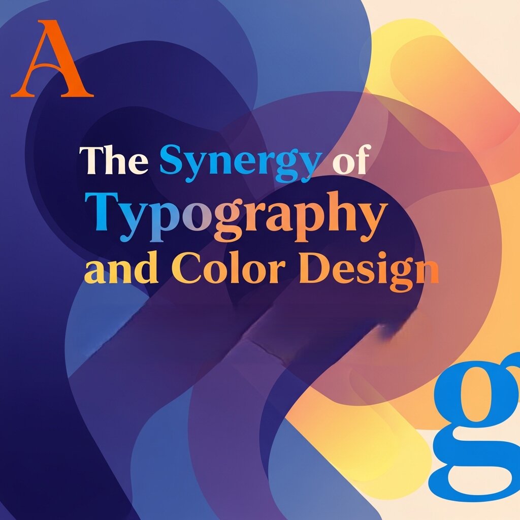 Typography gives your message a voice, while color gives it an emotion. When these two elements align perfectly, they guide the viewer’s eye effortlessly through a layout. Understanding how they interact is essential for anyone looking to build compelling visual narratives.
Building Emotional Connections
Different typefaces carry distinct personalities. A geometric sans-serif might feel modern and clinical, while a sweeping script conveys elegance and warmth. When you pair these typographic personalities with specific colors, you multiply their emotional impact. For example, a heavy, brutalist typeface rendered in a soft pastel pink creates an unexpected juxtaposition. It softens the aggressive nature of the font, resulting in a playful, modern aesthetic.
When planning your typography and color design, start by defining the core emotion of your project. Are you aiming for trust and stability? Navy blues paired with traditional serif fonts often do the trick. If you want high energy and excitement, neon yellows combined with bold, italicized sans-serifs will deliver that urgency.
Establishing Visual Hierarchy
Color is one of the most effective tools for establishing typographic hierarchy. You can use varying shades and tints to signal to the reader what they should look at first, second, and third. A bright, saturated color applied to a headline instantly draws the eye, allowing the supporting text to recede into a more muted, neutral tone.
Instead of relying solely on font size or weight to distinguish your headers from your body copy, try using color temperature. Warm colors like reds and oranges naturally advance toward the viewer, making them excellent choices for call-to-action buttons or crucial data points. Cool colors like blues and greens recede, making them perfect for background elements or secondary text.
Mastering Color Theory and Design in Typography
To push your layouts further, you need a strong grasp of how colors interact with each other. Applying color theory and design principles directly to your typography opens up a massive range of creative possibilities.
High Contrast for Maximum Readability
Accessibility should always be a priority. High contrast between your text and its background ensures that your message is legible to everyone. However, high contrast does not mean you are limited to black and white.
Consider using complementary colors—those sitting opposite each other on the color wheel. A deep plum background with soft yellow typography offers excellent readability while maintaining a rich, vibrant aesthetic. You can also experiment with split-complementary palettes to introduce a third color into the mix, perhaps using it for hyperlinks or highlighted quotes within the body text.
Monochromatic Magic
Monochromatic palettes use varying lightness and saturation of a single hue. This approach creates a highly cohesive and sophisticated look. When applying this to typography, you can create subtle, elegant designs that feel incredibly modern.
Imagine a layout utilizing a deep forest green for the background, a medium kelly green for the large display type, and a pale mint green for the body copy. The lack of color friction allows the viewer to focus entirely on the shapes of the letters and the meaning of the words. It creates a serene reading experience that feels intentional and highly curated.
Gradients and Text Masking
Solid colors are great, but gradients add depth and dimension to your typography. By masking a vibrant gradient inside a thick, heavy font, the text itself becomes the focal point of the artwork. This technique works exceptionally well for short, punchy headlines or hero sections on websites.
To keep the design balanced, pair gradient-filled typography with a solid, dark background. This allows the colors within the text to glow and prevents the overall composition from feeling chaotic. You can also reverse the technique: use a gradient background and punch out the text in crisp white, creating a sleek, atmospheric effect.
Innovative Typography Trends to Try
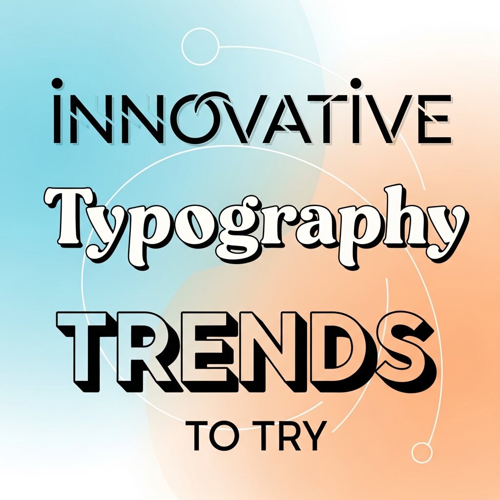 Staying current with design trends helps keep your portfolio fresh. As technology evolves, so do the ways we can manipulate text and color.
Kinetic Typography and AI Motion Graphics
Static text is no longer the only option. Kinetic typography—moving, stretching, and shifting text—is dominating digital spaces. It grabs attention on social media and adds a layer of interactivity to web design.
The integration of ai motion graphics has made this more accessible than ever. You can now generate complex animations and text transitions using intelligent software that understands the rhythm and pacing of your design. Try using bold, contrasting colors for your kinetic type to make the movement pop even more. A bright cyan word stretching across a dark magenta background creates a mesmerizing, hypnotic effect that users cannot scroll past.
Custom Typefaces and Hand-Drawn Elements
In response to the hyper-polished look of digital design, many creatives are returning to organic, hand-drawn typography. Custom lettering adds a human touch that standard web fonts simply cannot replicate.
When coloring hand-drawn type, consider using textured brushes and overlapping colors to mimic the look of physical media like risograph printing or screen printing. Slightly offsetting the color layers creates a “misregistered” look that feels raw, nostalgic, and incredibly charming.
Brutalism and Breaking the Grid
Brutalist web design embraces raw, unpolished aesthetics. It often features massive, oversized typography that intentionally breaks the traditional grid system. Words might run off the edge of the screen or overlap one another to the point of near-illegibility.
Color in brutalist typography is usually stark and unapologetic. Think bright web-safe blue, harsh neon green, or pure magenta. This style is not for every client, but it is a fantastic exercise in pushing boundaries and rejecting conventional design rules.
Tools to Elevate Your Workflow
Executing these ideas requires the right tools. While industry-standard software like Adobe Illustrator and Figma remain essential, new platforms are changing how we approach the design process.
Leveraging a Visual Curriculum Design Tool
If you are designing educational materials, onboarding documents, or instructional guides, organizing your typography is critical. A visual curriculum design tool can help you map out the flow of information before you even start applying color. These tools allow you to structure your content logically, ensuring that your typographic hierarchy aligns with the learning objectives. Once the structure is in place, you can confidently apply your color palette to guide the learner’s journey.
Generative AI for Color Palettes
Choosing the perfect color combination can be time-consuming. Generative AI tools are now capable of analyzing a brief or a mood board and instantly generating dozens of viable color palettes. You can input parameters like “vintage 1970s typography” or “cyberpunk neon text,” and the AI will provide a highly specific set of hex codes for you to experiment with. This rapid prototyping allows you to test more ideas in less time.
Accessibility and Inclusive Design Practices
Design is not just about aesthetics; it is about ensuring that everyone can access and understand your content. When working with typography and color design, accessibility should be a core consideration from the beginning. This includes maintaining sufficient contrast ratios, choosing legible typefaces, and avoiding color combinations that may be difficult for color-blind users to distinguish. Designers should also consider font size, spacing, and line height to enhance readability across different devices. Inclusive design ensures your message reaches a wider audience while improving user experience. By prioritizing accessibility, you create designs that are not only visually appealing but also functional, user-friendly, and socially responsible in today’s diverse digital landscape.
Creating Brand Consistency Through Typography and Color
Consistency is the backbone of strong visual branding. When typography and color design are applied consistently across all platforms, they reinforce brand recognition and trust. This means using the same font families, color palettes, and styling rules in your website, social media, marketing materials, and product interfaces. A unified visual identity helps users instantly recognize your brand, even before reading any text. Designers should establish clear brand guidelines that define how typography and color should be used in different contexts. This eliminates guesswork and ensures every piece of content aligns with the overall brand image. Consistency not only strengthens your visual presence but also creates a more professional and cohesive user experience.
Testing and Iterating Your Design Choices
 Even the most experienced designers cannot predict exactly how users will respond to a specific typography and color combination. That is why testing and iteration are essential parts of the design process. A/B testing different font styles, sizes, and color schemes allows you to gather real user feedback and identify what works best. Heatmaps and user behavior analytics can reveal how viewers interact with your content, highlighting areas that need improvement. Iteration is not about starting over; it is about refining your design based on data-driven insights. By continuously testing and adjusting your typography and color decisions, you ensure your designs remain effective, engaging, and aligned with user expectations over time.
Frequently Asked Questions (FAQ)
What is typography and color design?
Typography and color design refer to the strategic use of fonts and color combinations to communicate a message effectively. Typography controls how text looks and feels, while color influences emotion and visual impact. When combined correctly, they create engaging, readable, and aesthetically pleasing designs.
Why is the combination of typography and color important?
The combination is essential because it directly affects readability, user experience, and emotional response. Good typography ensures clarity, while color adds meaning and hierarchy. Together, they guide the viewer’s attention and help communicate the intended message more effectively.
How do I choose the right color for typography?
Start by considering contrast and readability. Ensure your text stands out clearly against the background. Then think about emotion and branding—choose colors that align with the message you want to convey. For example, blue suggests trust, while red creates urgency and excitement.
What is the best font and color combination for readability?
High contrast combinations work best, such as dark text on a light background or vice versa. Black on white is the most common, but combinations like navy on light gray or dark purple on soft yellow can also provide excellent readability while adding visual interest.
Can I use multiple colors in typography?
Yes, but it should be done carefully. Use multiple colors to create hierarchy or highlight important elements, such as headings or call-to-actions. Avoid overusing too many colors, as it can make the design look cluttered and confusing.
How does color affect typography hierarchy?
Color helps establish visual hierarchy by directing attention. Bright or warm colors can highlight important text like headings, while muted or neutral tones can be used for body text. This makes it easier for users to scan and understand content quickly.
Bringing Your Next Canvas to Life
Typography and color are the two most powerful levers you can pull to dictate the mood, readability, and impact of your work. By stepping outside your comfort zone—whether that means experimenting with complementary contrasts, embracing kinetic movement, or utilizing new AI technologies—you can discover visual combinations that captivate your audience.
Take a look at your current projects and challenge yourself to change one fundamental rule you usually follow. Swap a neutral background for a vibrant gradient, or replace a safe sans-serif with an expressive custom typeface. The most memorable designs are often born from a willingness to experiment and let the text and colors speak for themselves.


