

Great design doesn’t just look good—it communicates something. A well-crafted visual can spark emotion, build trust, and move people to act, often before a single word is read. That’s the quiet power of creative graphic design.
Yet many brands and designers fall into the same traps: safe color choices, generic layouts, and visuals that blend into the background rather than standing out. The result? Content that gets scrolled past, presentations that don’t land, and brand identities that fail to leave a lasting impression.
This post breaks down the strategies that separate forgettable design from genuinely effective visual communication. From leveraging color theory and design psychology to embracing custom creative design and AI motion graphics, these are the approaches that sharpen how your work looks, feels, and connects.
Why Visual Communication Deserves a Strategic Approach
Most people think of design as an aesthetic decision. In reality, it’s a communication decision. Every color, typeface, layout, and motion element sends a signal to the viewer—consciously or not.
Research consistently shows that visual content is processed faster than text. The brain interprets images roughly 60,000 times quicker than written information, according to studies cited by 3M Corporation. This means that before your audience reads a headline or clicks a button, your design has already started shaping their perception.
That’s why applying strategy to creative graphic design matters. Without it, even technically polished work can fail to communicate the right message, to the right people, in the right way.
How Color Theory and Design Psychology Work Together
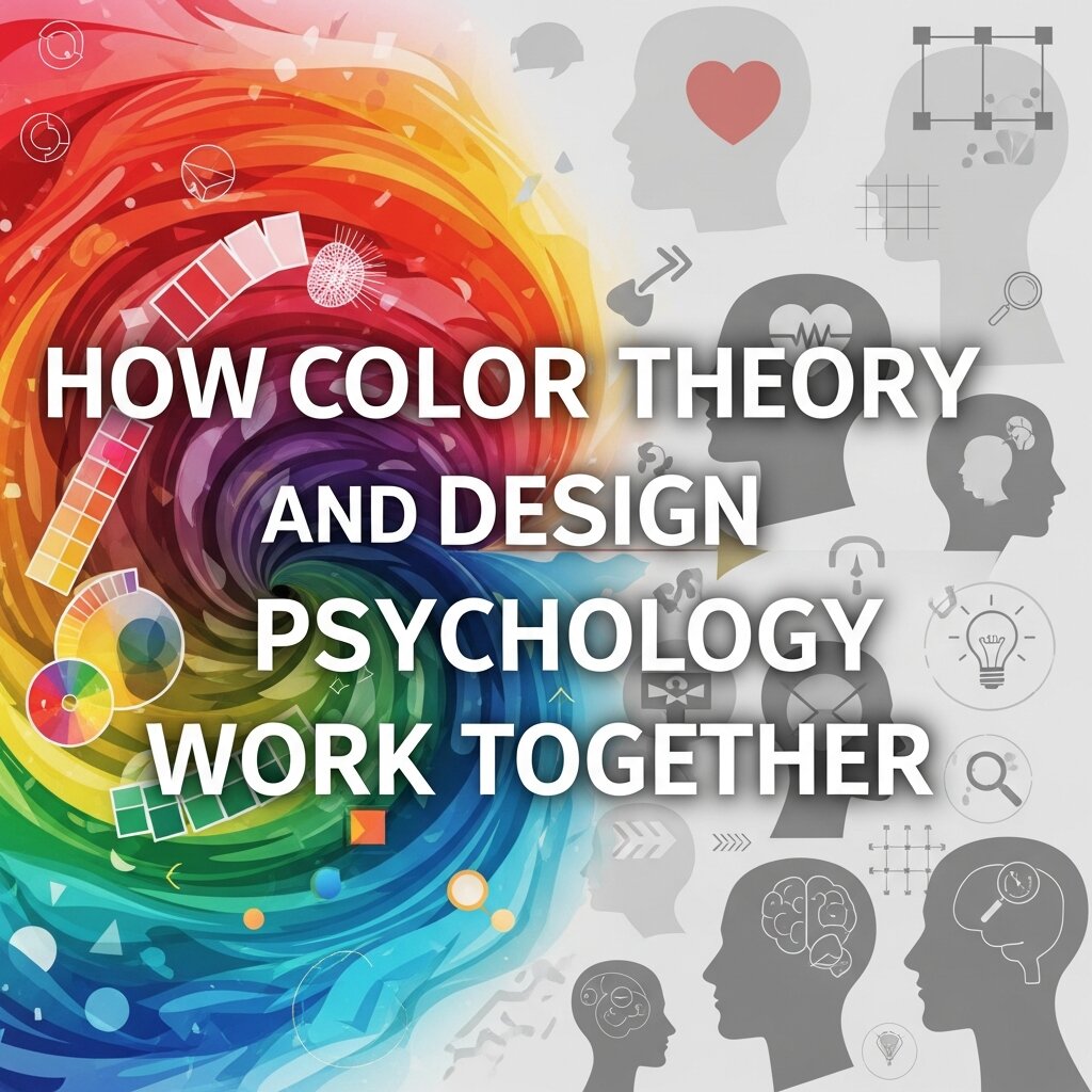 Color is one of the most powerful tools in a designer’s toolkit—and one of the most frequently misused. Color theory and design isn’t just about choosing shades that look appealing together. It’s about understanding how colors influence mood, perception, and behavior.
What Does Color Theory Actually Tell Us?
Color theory is a framework for understanding how colors relate to one another and how they affect human psychology. The color wheel, developed by Sir Isaac Newton in 1666, forms the foundation. Complementary colors (those opposite on the wheel) create visual tension and contrast, while analogous colors (those adjacent) produce harmony and cohesion.
Beyond aesthetics, colors carry psychological weight:
- Blue signals trust, stability, and calm—used heavily by financial institutions and tech companies for this reason.
- Red triggers urgency and excitement, making it effective for calls-to-action and clearance sales.
- Green communicates health, growth, and sustainability, a natural fit for wellness and eco-conscious brands.
- Yellow evokes optimism and energy but can cause visual fatigue at high saturation.
Applying Color Strategy to Real Design Decisions
Knowing color theory is one thing; applying it consistently is another. Effective creative graphic design uses a defined color palette that reflects both brand personality and audience expectations. A fintech startup targeting millennials, for example, will make very different color choices than a luxury skincare brand targeting women over 40.
A practical approach: define a primary color (your dominant brand color), a secondary color (for accents and highlights), and a neutral (for backgrounds and body text). This three-tier system prevents visual clutter while giving you enough range to create contrast and hierarchy.
The Case for Custom Creative Design Over Templates
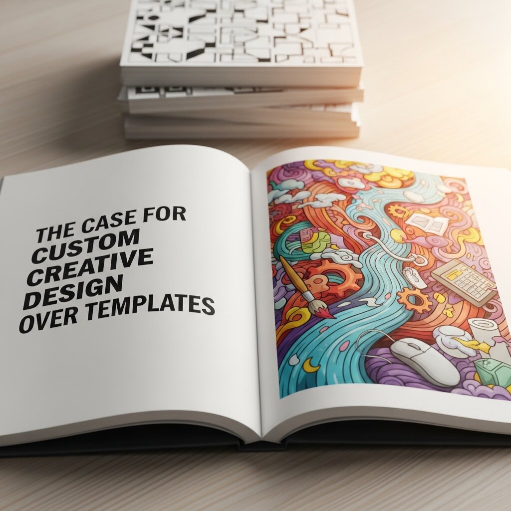 Template-based design tools have democratized visual communication. Platforms like Canva and Adobe Express make it easy for anyone to produce polished graphics quickly. But there’s a real cost to over-relying on templates: your brand starts to look like everyone else’s.
Custom creative design is the process of building visuals from the ground up, tailored to a specific brand, audience, and purpose. This approach produces stronger results for several reasons.
Differentiation: Custom design signals that a brand has invested in its visual identity. This subtly communicates quality and intentionality to the audience.
Consistency: When every design element—from icon style to illustration tone—is built around a specific brand system, the result is a coherent visual language that reinforces recognition over time.
Flexibility: Template designs are built for general use. Custom design solves specific problems—whether that’s communicating a complex data story, guiding a user through a multi-step process, or creating an emotional moment in a brand campaign.
When Should You Invest in Custom Creative Design?
Custom design delivers the most value at high-impact moments: brand launches, campaign refreshes, product releases, and key marketing materials. For lower-stakes or high-frequency content (social media posts, internal documents), templates can still play a role—provided they’re built on a custom-designed foundation rather than borrowed from a generic library.
Hierarchy, Layout, and the Architecture of Attention
Color grabs attention. Layout directs it. Understanding visual hierarchy is central to any strong creative graphic design strategy.
Visual hierarchy is the principle of organizing design elements so that viewers naturally look at the most important information first. This is achieved through size, contrast, placement, and spacing.
Practical Principles for Stronger Layout
Lead with scale: Larger elements draw the eye first. Your headline, hero image, or primary call-to-action should dominate the composition.
Use white space deliberately: Empty space isn’t wasted space. It reduces cognitive load and helps important elements breathe. Designs that feel cluttered often suffer from insufficient white space, not insufficient content.
Create clear entry points: Every design piece should have one dominant visual element—the place where the eye enters. Multiple competing focal points confuse the viewer and dilute the message.
Align with purpose: Grid-based layouts create order and predictability, which builds trust. Breaking the grid—deliberately and sparingly—creates surprise and emphasis. The key word is deliberately.
Typography as a Communication Tool
Typography is far more than a vehicle for words. The typeface you choose, the size you set, and the spacing you apply all contribute to how a message feels before it’s read.
Serif typefaces (like Times New Roman or Garamond) carry associations with tradition, authority, and heritage. Sans-serif typefaces (like Helvetica or Inter) feel modern, clean, and accessible. Display and script typefaces add personality but sacrifice legibility at small sizes.
For effective creative graphic design, treat typography as a layered system:
- Display/Heading font: Sets the tone. Should be distinctive but legible at large sizes.
- Body font: Prioritizes readability over personality. High x-height and generous letter spacing work best.
- Accent font: Used sparingly for callouts, pull quotes, or labels.
Pairing typefaces well is an art form. A common approach is to combine one serif and one sans-serif, letting contrast do the work. Avoid pairing two typefaces with similarly strong personalities—they compete rather than complement.
AI Motion Graphics: Where Creative Design Is Heading
Motion has become one of the most effective formats in visual communication. Video content consistently outperforms static visuals across social media, email, and web engagement metrics. And thanks to AI motion graphics tools, creating compelling animated content is now far more accessible than it once was.
AI motion graphics refers to the use of artificial intelligence to generate, animate, or enhance visual content in motion—reducing the time and technical skill traditionally required to produce professional-quality animation.
How AI Motion Graphics Are Changing the Design Workflow
Tools like RunwayML, Kling AI, and Adobe’s Firefly suite now allow designers to animate static images, generate motion backgrounds, and create video transitions with minimal manual effort. This has several practical implications:
Speed: Animations that once took hours to keyframe manually can now be generated in minutes, freeing designers to focus on strategy and creative direction.
Accessibility: Teams without dedicated motion designers can now produce animated content at a quality level that was previously out of reach.
Personalization at scale: AI motion graphics tools can generate multiple variations of an animation quickly, enabling A/B testing and audience-specific customization that would have been cost-prohibitive before.
That said, AI motion graphics work best when guided by strong creative graphic design fundamentals. AI can execute—it still needs a human to direct, refine, and ensure the output aligns with brand intent.
Designing for Consistency Across Channels
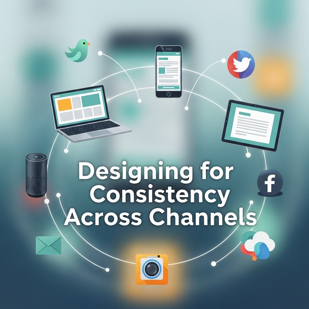 A strong visual identity doesn’t live in a single asset. It shows up consistently across every touchpoint—your website, social media profiles, email templates, pitch decks, print materials, and motion content.
Consistency reinforces recognition. When audiences see the same colors, typefaces, and visual language repeated across channels, they build mental associations between those elements and your brand. Over time, this makes your visual communication more efficient—you need less space and fewer words to communicate who you are.
A brand style guide is the primary tool for maintaining this consistency. A thorough guide documents:
- Color palette (with HEX, RGB, and CMYK values)
- Typography hierarchy and usage rules
- Logo usage and clear-space guidelines
- Imagery style and direction
- Icon and illustration style
- Tone and motion guidelines (increasingly important as AI motion graphics become standard)
Investing time in a comprehensive style guide pays dividends every time a new asset is created, ensuring that individual design decisions reinforce the broader visual system rather than undermining it.
Measuring the Effectiveness of Your Visual Communication
Creative instinct matters. But data matters too. Tracking how visual content performs helps refine your creative graphic design strategy over time.
Key metrics worth monitoring include:
- Engagement rate: Are people interacting with your visual content (likes, shares, clicks)?
- Time on page: Well-designed content keeps people reading. A high bounce rate may signal a visual communication problem.
- Conversion rate: For campaign assets, are the visuals moving people toward the desired action?
- Brand recall: In awareness campaigns, research and surveys can measure how well your visuals are being remembered.
Use these signals not to second-guess every creative decision, but to identify patterns. If a certain color scheme, layout style, or motion treatment consistently outperforms others, that’s creative intelligence worth building on.
Building a Visual Communication Strategy That Lasts
Strong visual communication is cumulative. Each well-designed asset builds brand recognition, each consistent color choice reinforces identity, and each motion graphic that resonates extends reach. The creative graphic design strategies outlined here—from color theory and design psychology to custom creative design and AI motion graphics—are not isolated tactics. They work best as an integrated system.
Start by auditing your existing visual materials. Identify where the inconsistencies are, where the messaging is unclear, and where the visual hierarchy breaks down. From there, build a design system grounded in your brand strategy, guided by design fundamentals, and open to the emerging tools—like AI motion graphics—that are reshaping what’s possible.


