

In the world of creative design, color isn’t just decoration—it’s a strategic tool that influences perception, emotion, and behavior. Whether you’re crafting a brand identity, designing a website, or developing marketing collateral, understanding the psychological effects of color choices can transform a good design into an unforgettable experience. In this comprehensive guide, we’ll explore the science behind color psychology, practical techniques for selecting impactful palettes, and real-world examples that drive user engagement while maintaining accessibility and brand consistency.
1. What Is Color Psychology in Design?
Color psychology examines how different hues affect human feelings and actions. This field draws insights from visual perception, cultural associations, and neuroscience to explain why we react positively to warm reds or trust the calm of blues. Designers leverage these insights to create emotional resonance with audiences. For instance, a food delivery app might use red to stimulate appetite and urgency, while a meditation platform opts for soothing greens to convey balance and relaxation. Recognizing that color responses can be subjective and context-dependent is key to making informed design decisions.
2. The Impact of Color on User Engagement
Every pixel on a screen contributes to the user’s overall impression. Studies show that first impressions form in just 50 milliseconds, and color plays a major role in shaping that perception. Engaging color schemes can guide users through interfaces, highlight calls to action, and reinforce brand messaging. For example, a contrasting button color can boost click rates by drawing the eye, while a cohesive palette across landing pages strengthens brand recognition. By consciously applying color theory, you can direct attention, reduce cognitive load, and create memorable interactions that encourage users to explore further.
3. Fundamentals of Color Theory
At the heart of every successful palette lies color theory. The color wheel, developed by Isaac Newton, organizes hues into primary, secondary, and tertiary categories. Complementary colors sit opposite each other, creating high contrast and vibrant energy when paired. Analogous colors, found side by side, offer harmonious transitions and a more subtle aesthetic. Triadic schemes combine three evenly spaced hues for balanced yet dynamic compositions. Understanding warm versus cool colors helps you set emotional tone—warm tones like orange and yellow evoke excitement, while cool tones like blue and purple suggest calmness. By mastering these basic relationships, you can build palettes that feel intentional and cohesive.
4. Choosing the Right Color Palette
Selecting a palette starts with your brand’s personality and target audience. Begin by defining key emotions and associations—trust, innovation, playfulness, or luxury. Next, identify a primary color that anchors your design and secondary colors that support brand messaging. Accent colors should highlight calls to action or critical information. Tools like Adobe Color, Coolors, and Material Design Palette help visualize harmonies and generate accessible combinations. Always test how colors appear across devices and under different lighting conditions. A palette that shines on a designer’s screen may lose its vibrancy on mobile devices or projectors without proper calibration.
5. Essential Tools and Resources for Color Selection
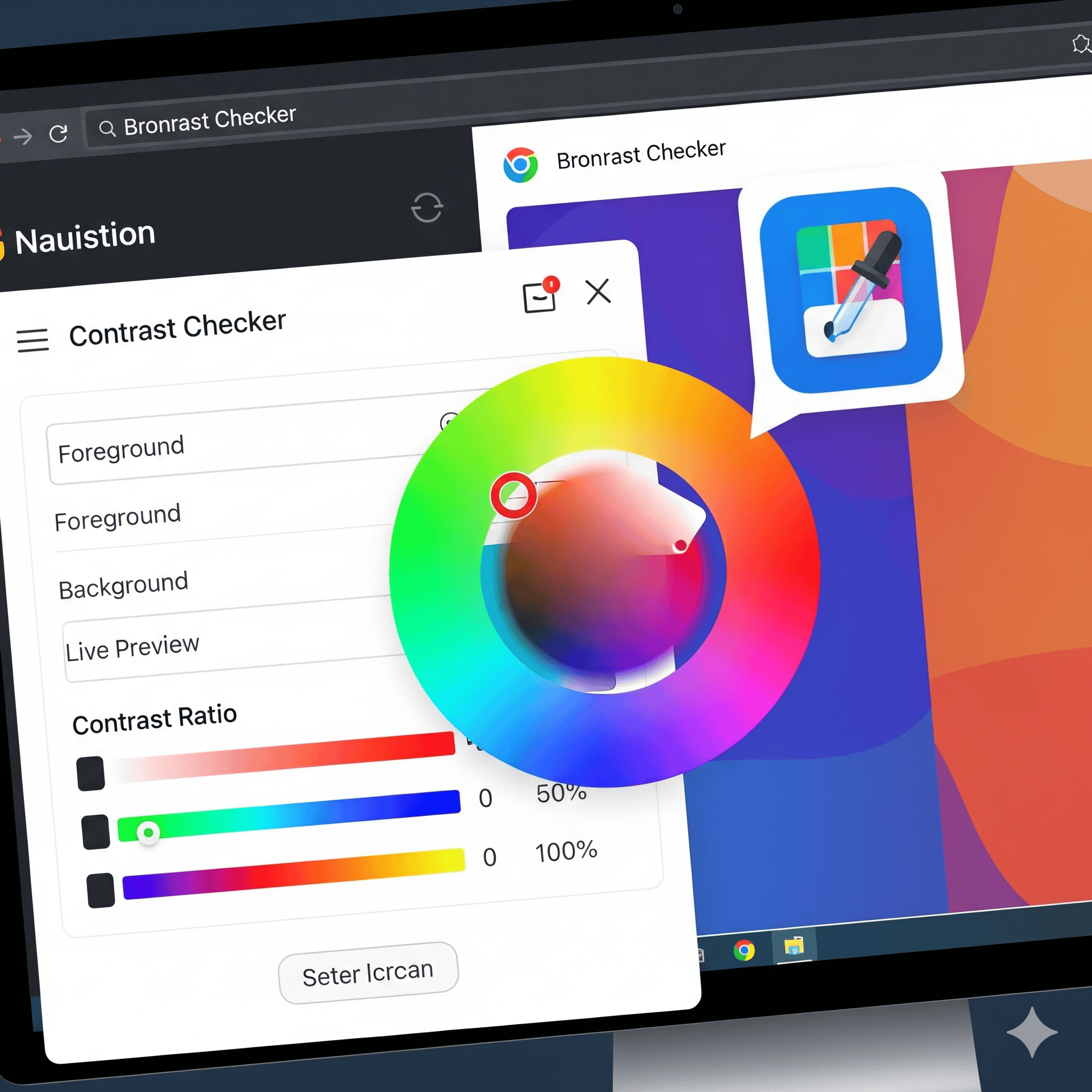
Modern designers have powerful tools at their fingertips. Color theory applications like Adobe Color CC offer interactive wheels and theme extraction from images. Browser extensions such as ColorZilla enable on-the-fly sampling and gradient generation. Contrast checkers like WebAIM ensure your palette meets WCAG standards for text legibility. For inspiration, platforms like Dribbble, Behance, and Pinterest showcase trending palettes in real-world contexts. By combining these resources, you can iterate rapidly and maintain consistency across branding assets, websites, and print materials.
6. Guiding User Attention with Color
Effective color usage directs the eye through your interface. Use high-contrast hues for primary actions like signup buttons or sale notifications. Reserve bright accent colors for single-purpose elements to prevent visual fatigue. Backgrounds in neutral tones provide breathing room and make key content stand out. Gradient overlays can create depth and motion, subtly encouraging users to scroll. When designing data visualizations, apply color consistently—assign the same hue to a product category across charts to avoid confusion. Thoughtful color hierarchy ensures users focus on what matters most without distraction.
7. Ensuring Accessibility and Inclusivity
An engaging design must be available to everyone. Color-blind users, accounting for up to 8 percent of men and 0.5 percent of women, face challenges distinguishing certain hues. Employ contrast ratios of at least 4.5:1 for text and background pairs. Avoid relying solely on color to convey information—combine with icons, labels, or patterns. Tools like Stark and Color Oracle simulate color-blind vision, helping you catch potential issues early. Inclusive design not only broadens your audience but also enhances overall user experience by reducing ambiguity—making it an essential pillar of sustainable creative design that prioritizes longevity, equity, and impact.
8. Case Studies: Color Psychology in Action
Consider Spotify, which uses bold greens and blacks to convey energy and creativity, aligning with its mission to empower music discovery. The brand consistently applies its palette across apps, marketing emails, and physical events, reinforcing a unified identity. In another example, Airbnb adopts warm reds and soft blues to evoke feelings of belonging and trust, crucial for a platform centered on personal stays. These brands illustrate how strategic color choices support core values, foster emotional connections, and drive engagement metrics like time on site and conversion rates.
9. Best Practices and Pro Tips
- Start with a neutral base to ensure versatility across different media.
- Limit your palette to 3–5 colors to maintain visual coherence.
- Use saturation and brightness variations of a hue to add depth without introducing new colors.
- Regularly A/B test color variations for buttons and banners to optimize engagement.
- Document your palette in a style guide to ensure consistency across teams.
Conclusion
Color psychology is more than an artistic flourish—it’s a science that informs every aspect of user experience and brand perception. By understanding the emotional impact of hues, applying fundamental color theory, and prioritizing accessibility, you can craft compelling designs that captivate audiences and drive measurable results. Whether you’re launching a new brand or refreshing an existing product, mastering color psychology will elevate your creative work and deepen your connection with users. Begin experimenting today, and let color guide you toward more engaging, inclusive, and memorable designs.
Learn more about: Emotion-Driven Creative Design: Techniques to Forge Deep Connections with Your Audience


